A robust and scalable design system for the startup JOTA


2021-Now
Design Lead, Product Design, DesignOps, QA
Figma, Storybook, Confluence, Coda, Zeroheight
This Design System was conceived and developed to meet the need for creating fast-paced, scalable digital products. This goal was reached, but it also significantly strengthened JOTA's brand.
JOTA is a startup based in São Paulo and Brasília, Brazil. It main focus is journalism and technology, publishing news about Brazil's three branches of government in its website and a suite of services, tools and solutions called JOTA PRO, exclusive for medium/big sized companies and law firms. I was a employee there from march 2019 to may 2024 and this Design System is one of the projects I've created and worked on there with my team.


With a variety of products, tools, and mediums at our disposal (and thinking about what would come ahead), the startup deliverables was somewhat lacking in consistency and unity, which was weakening the brand. Additionally, my team required something scalable and easy to work with, as we needed to solve problems with a fast pace.
With that said, our main challenge at the time was the lack of a UX design and product culture within the company. Additionally, we were in the middle of the COVID-19 pandemic. Everyone was trying to adjust to “new beginnings” happening back and forth. Me and my jr. design partner were eager to make change.
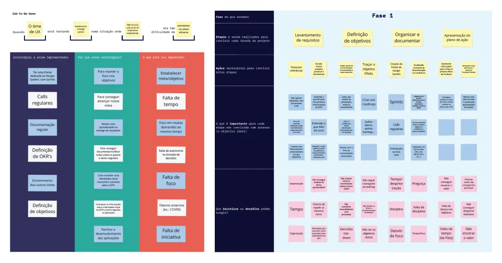
So we've faced not one, but three big challenges: implement a UX design and product culture within the company AND build a scalable design system from scratch, WHILE navigating the ”new normal”. Our JTBD whiteboard and phased planning reflected all that.
When planning our Design System, it was imperative to consider the design principles that would be our foundation, as to ensure coherence, efficiency, aesthetic appeal and brand identity. Here are the principles that we chose to work with:

Our Design System must be accessible, easy to work with and adaptable to future changes

Throughout color, typography and layout, we must ensure our Design System is robust

Our components have to be cohesive apart and together, to strengthen the brand
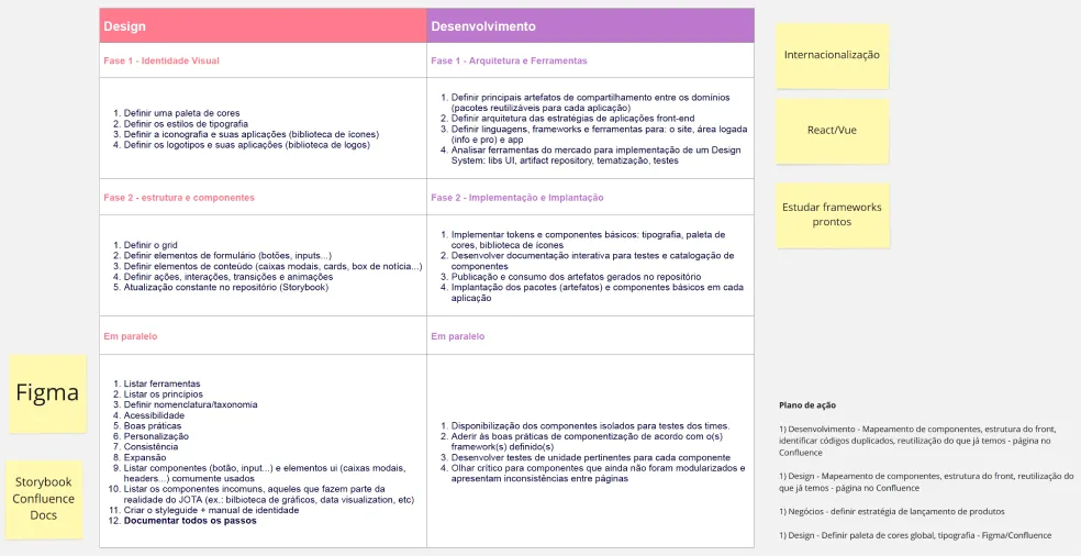
With the plan in hands, I pitched the Design System to the whole team. It was a success. Everyone agreed that building and implementing it would be the right course of action. With the development team, we them started to think what technology we would use. At first, we were considering using native React or other frameworks but, since our future projects would be in NextJS, the developers decided to go with that.
To ensure we're on par with the market, we did research on the best design systems we could find. Here are our main inspirations and references:
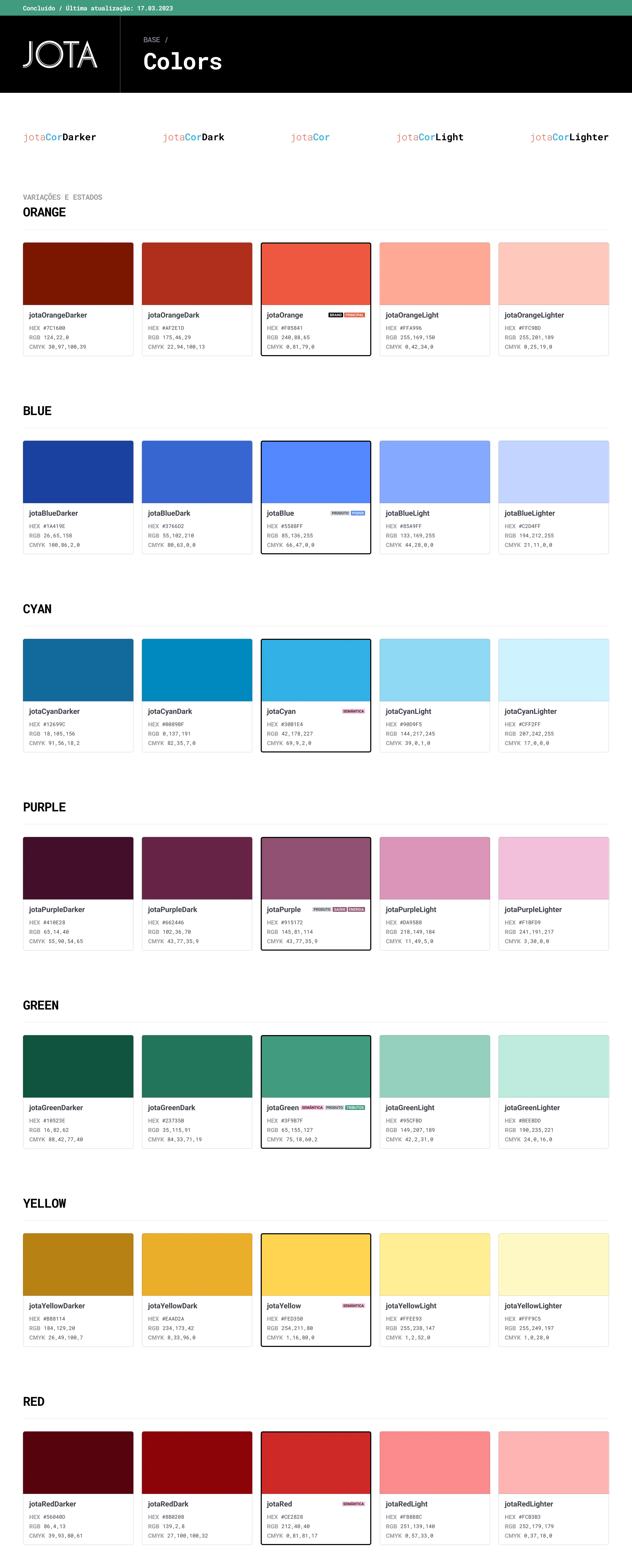
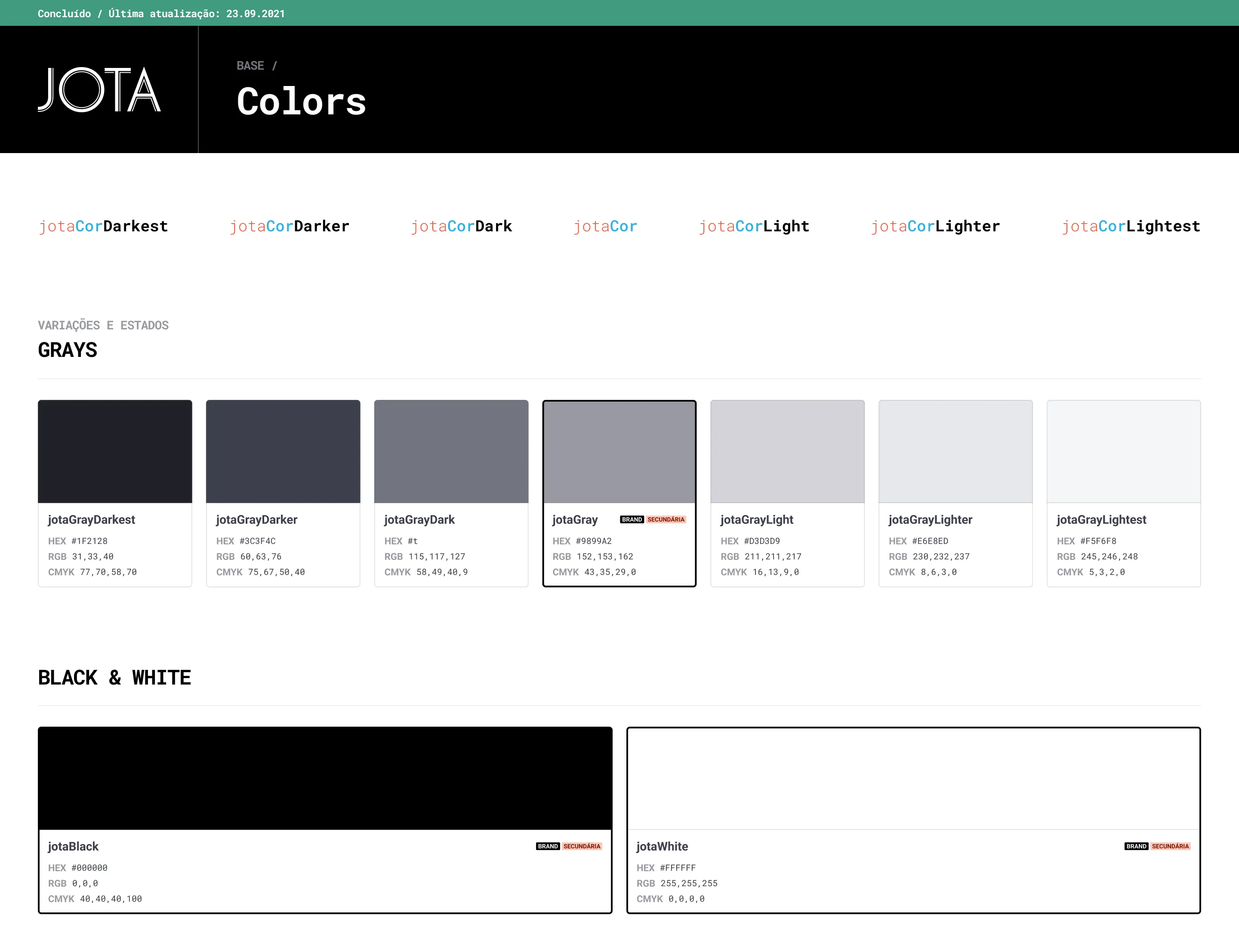
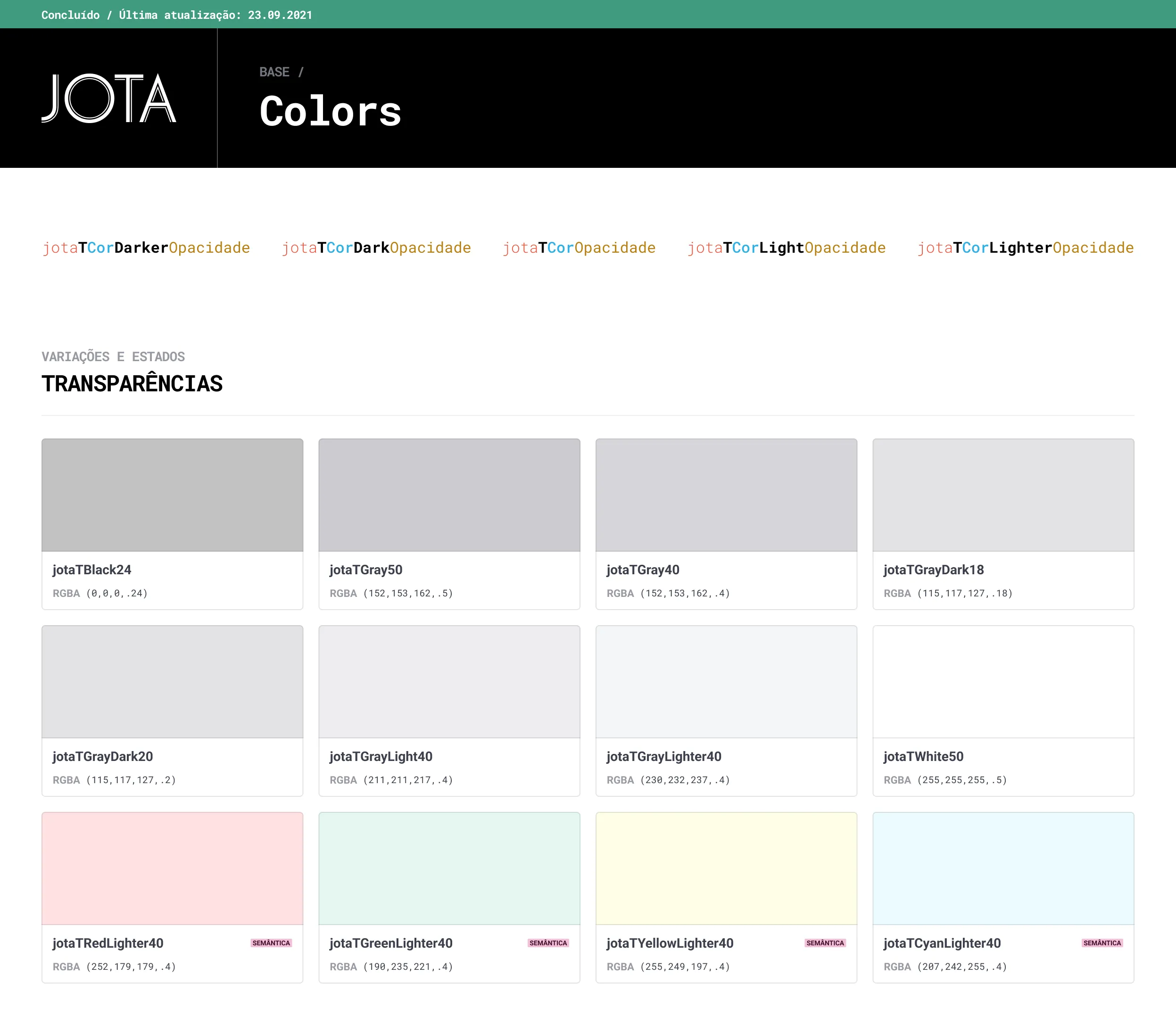
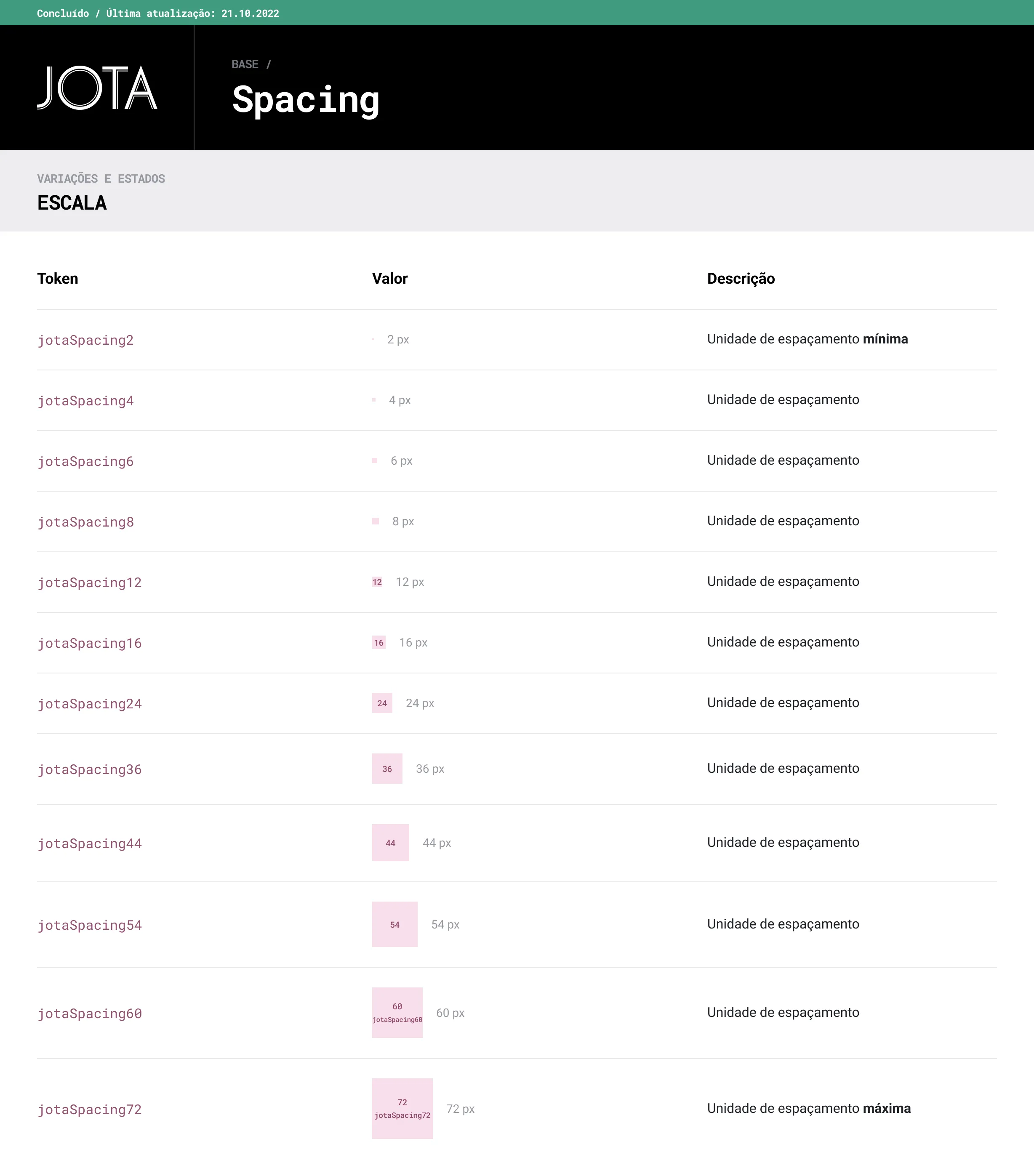
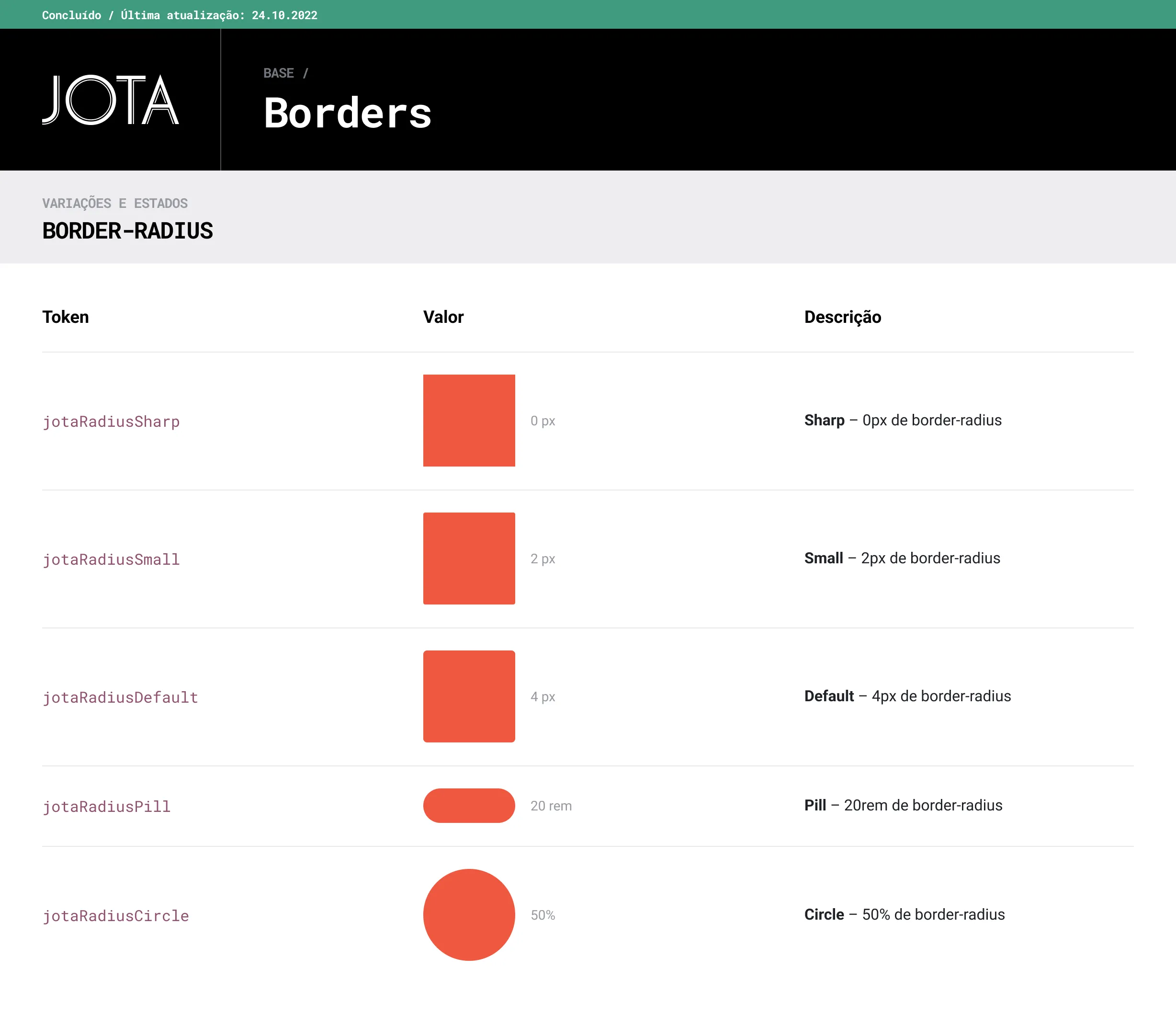
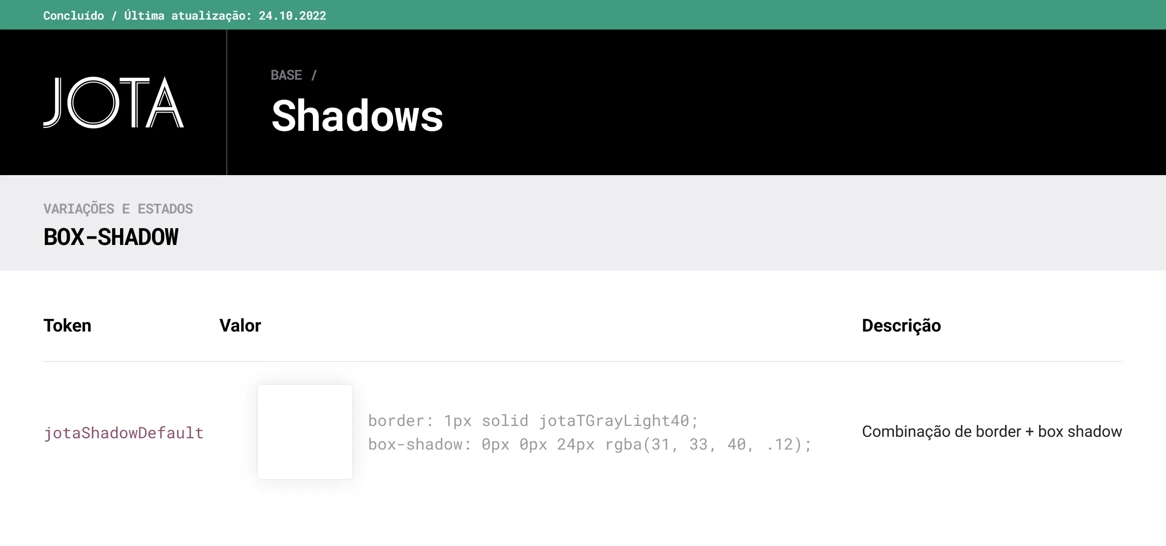
Before the components, we needed to establish the basics. Colors, typography, spacing, grid... We created a complete style guide that would serve not just for the Design System, but also as brand design guidelines.
Before the Design System, the extended palette had another purpose: to color our infographics. They are now more integrated into the branding, and some colors have been repurposed to be used as semantic colors.
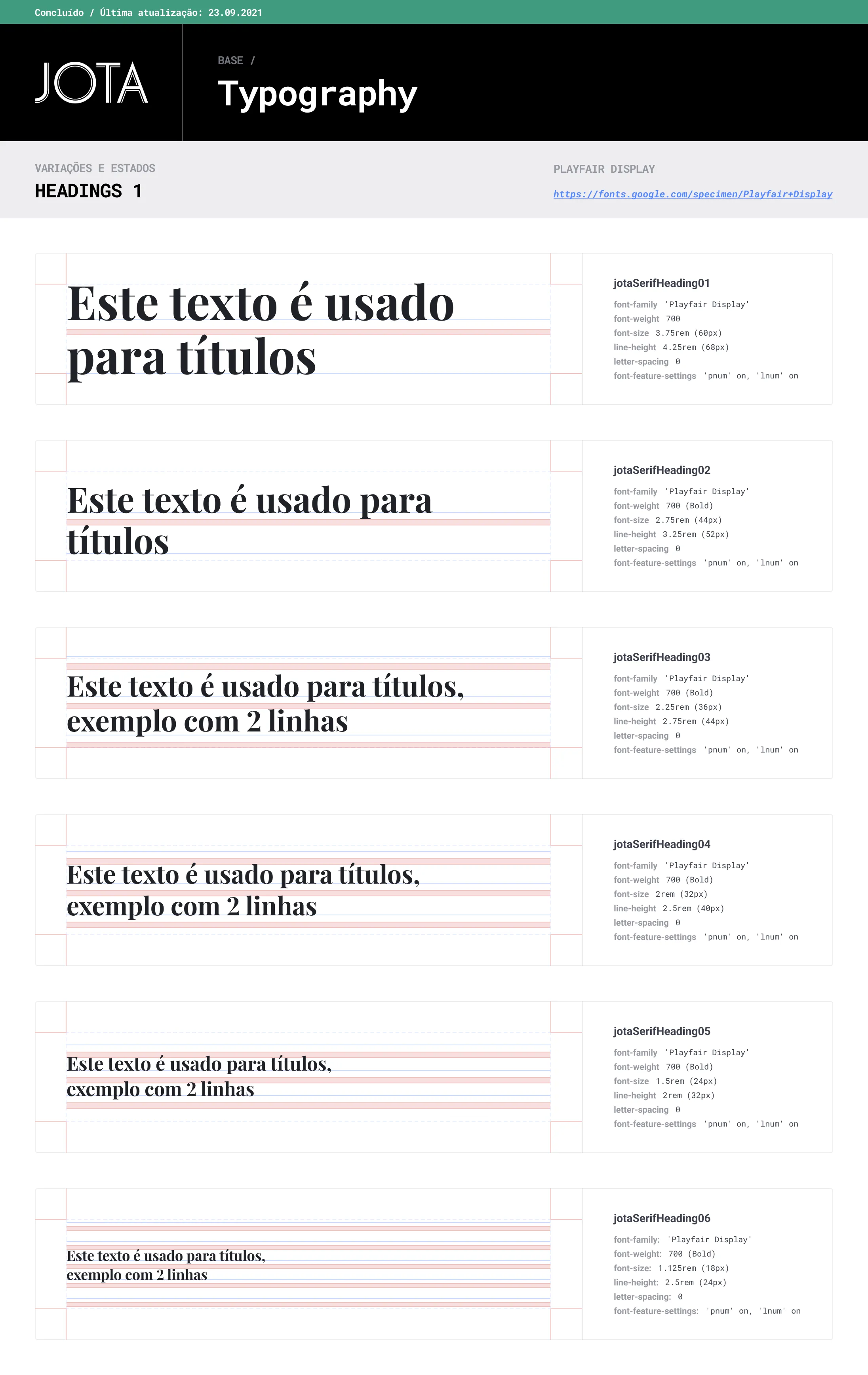
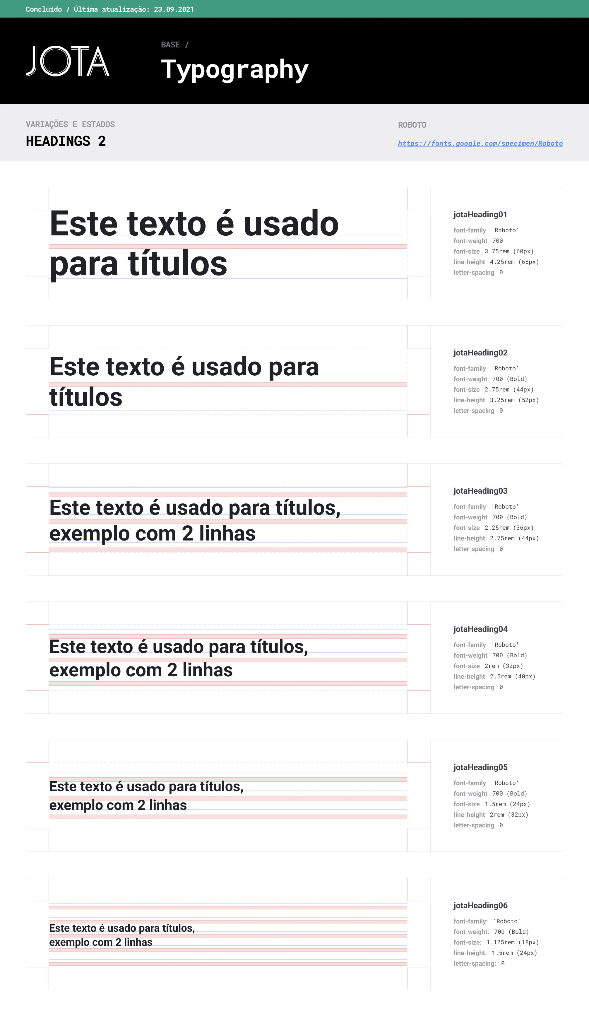
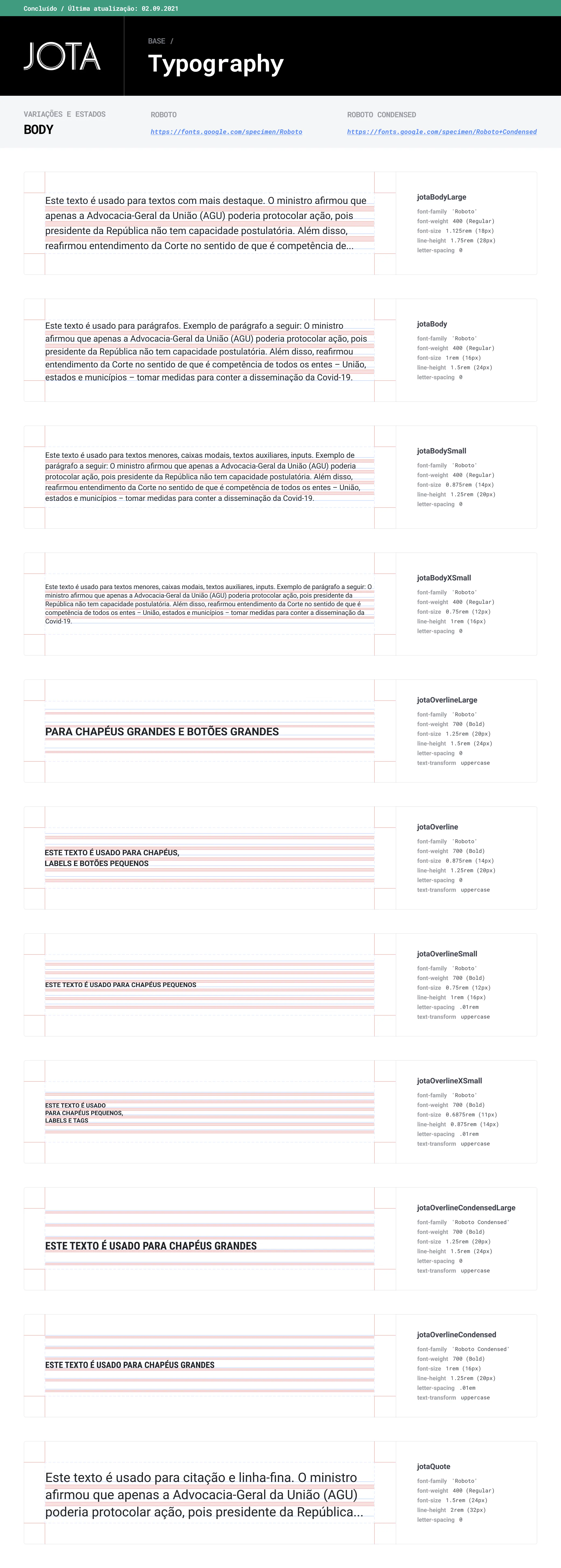
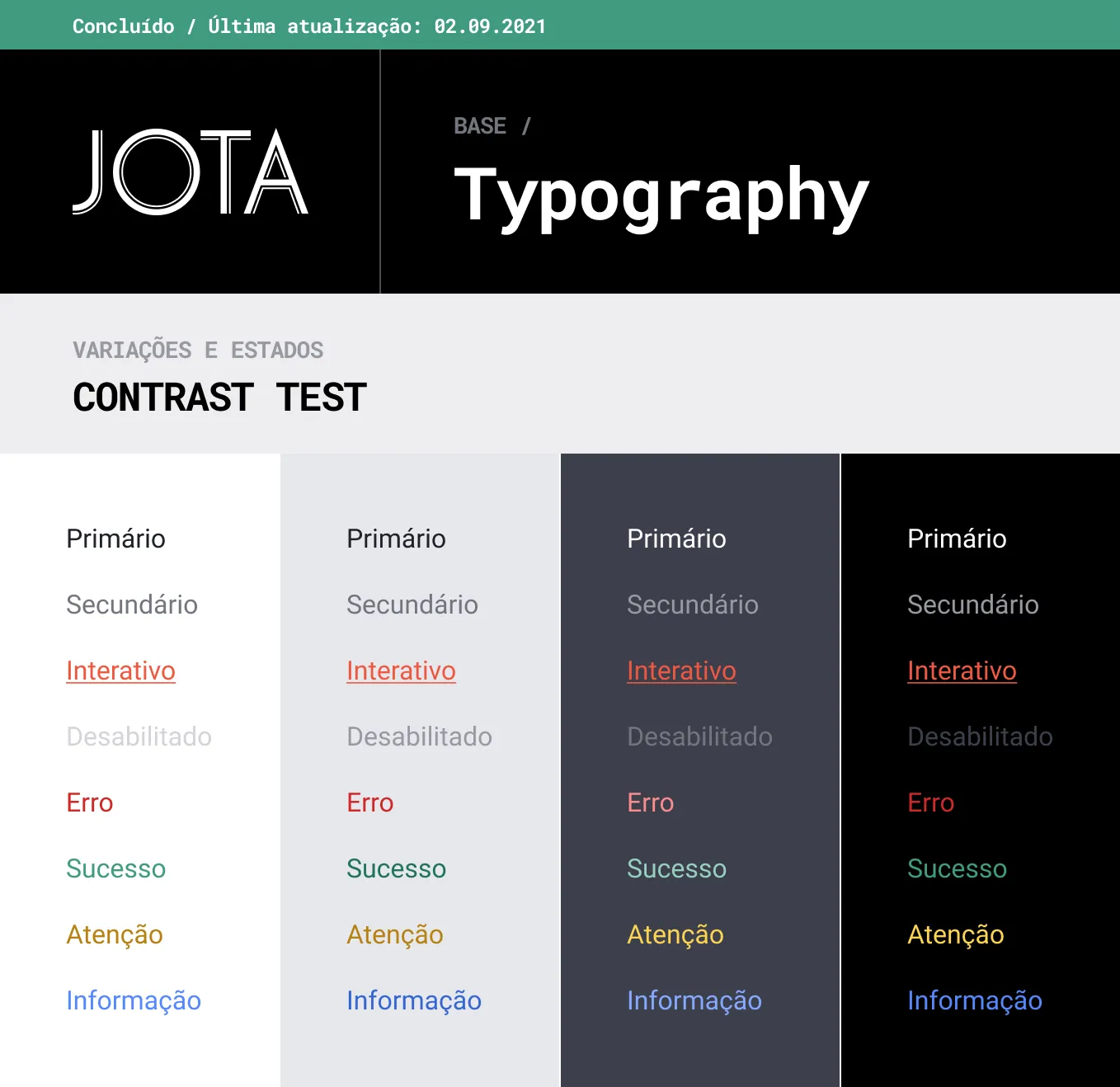
For the typography I had to consider more styles than the usual, keeping in mind not only a SaaS platform, but also a news portal. For the headings, JOTA originally had serif and sans serif styles, as shown below. In the future, we would end up ditching the serif styles completely, to ensure more readability and consistency.
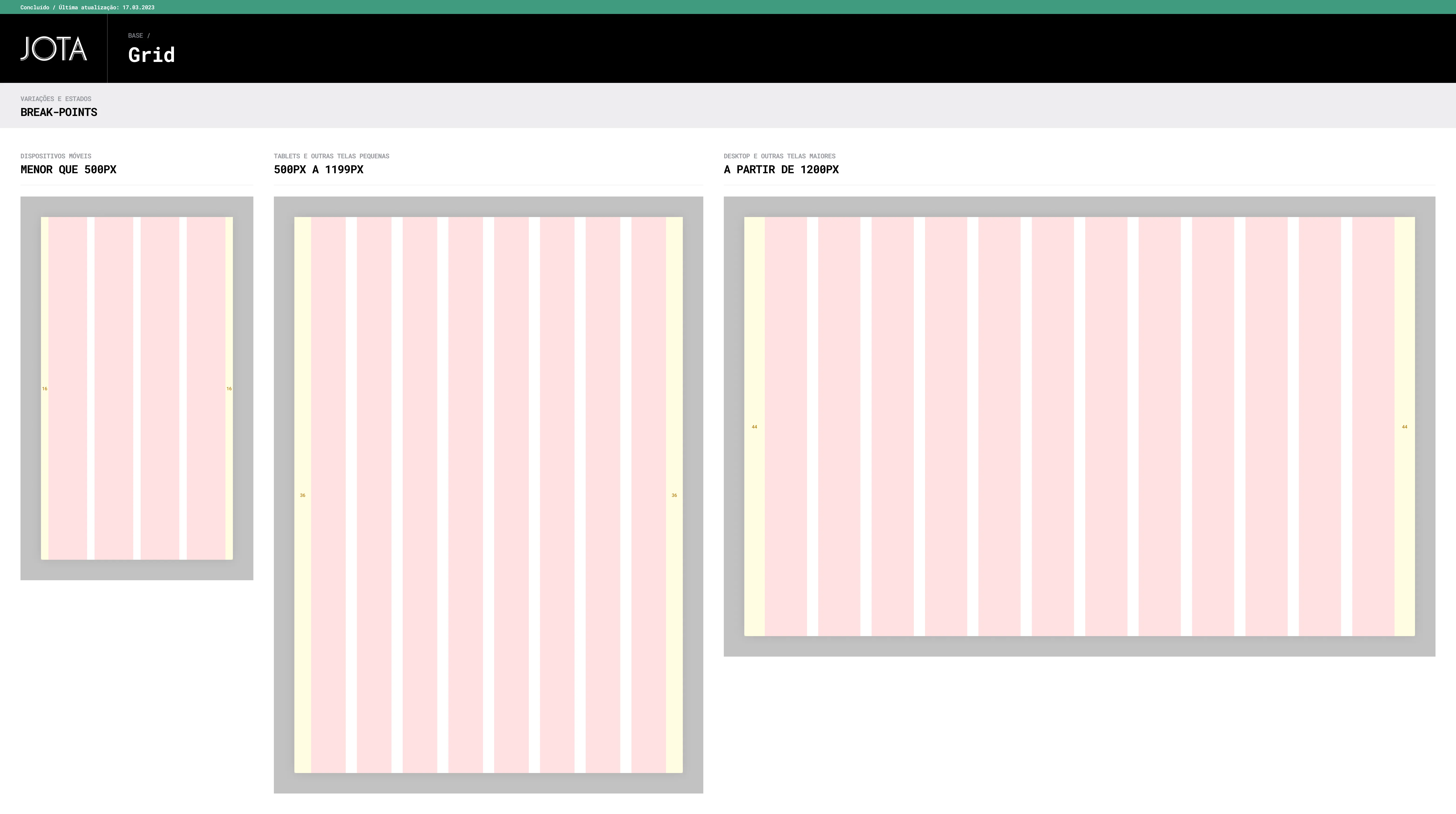
For the grid, I established 3 break points: mobile devices, tablet and other small screens and desktop and other large screens. I've considered this specific break points based on data for the most used screen sizes from our visitors, according to Google Analytics.
For the base UI, I've used Material Design icons. For the social media icons, I've used the default ones, following each brand guidelines. The majority of the newsletter icons were made by a third party, before my time on JOTA. The rest of the icons were made by me.
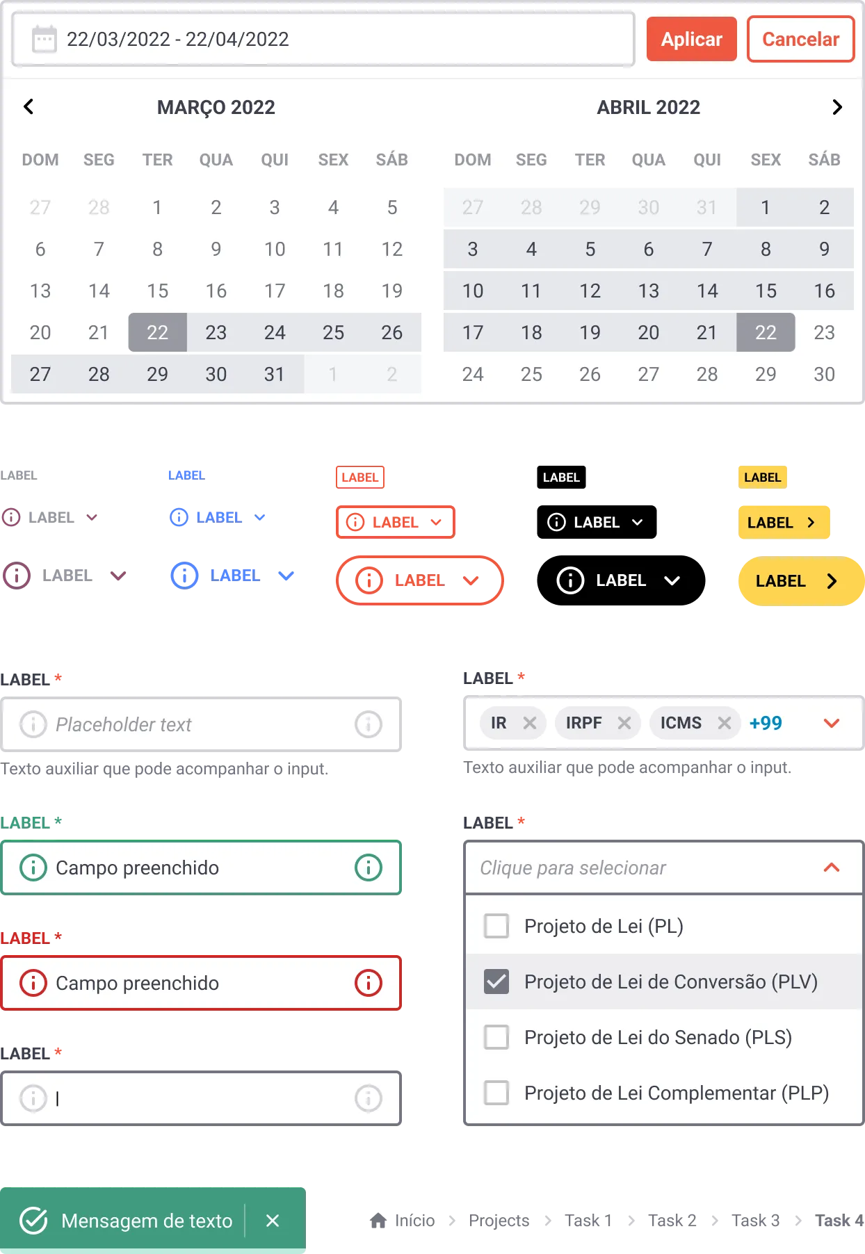
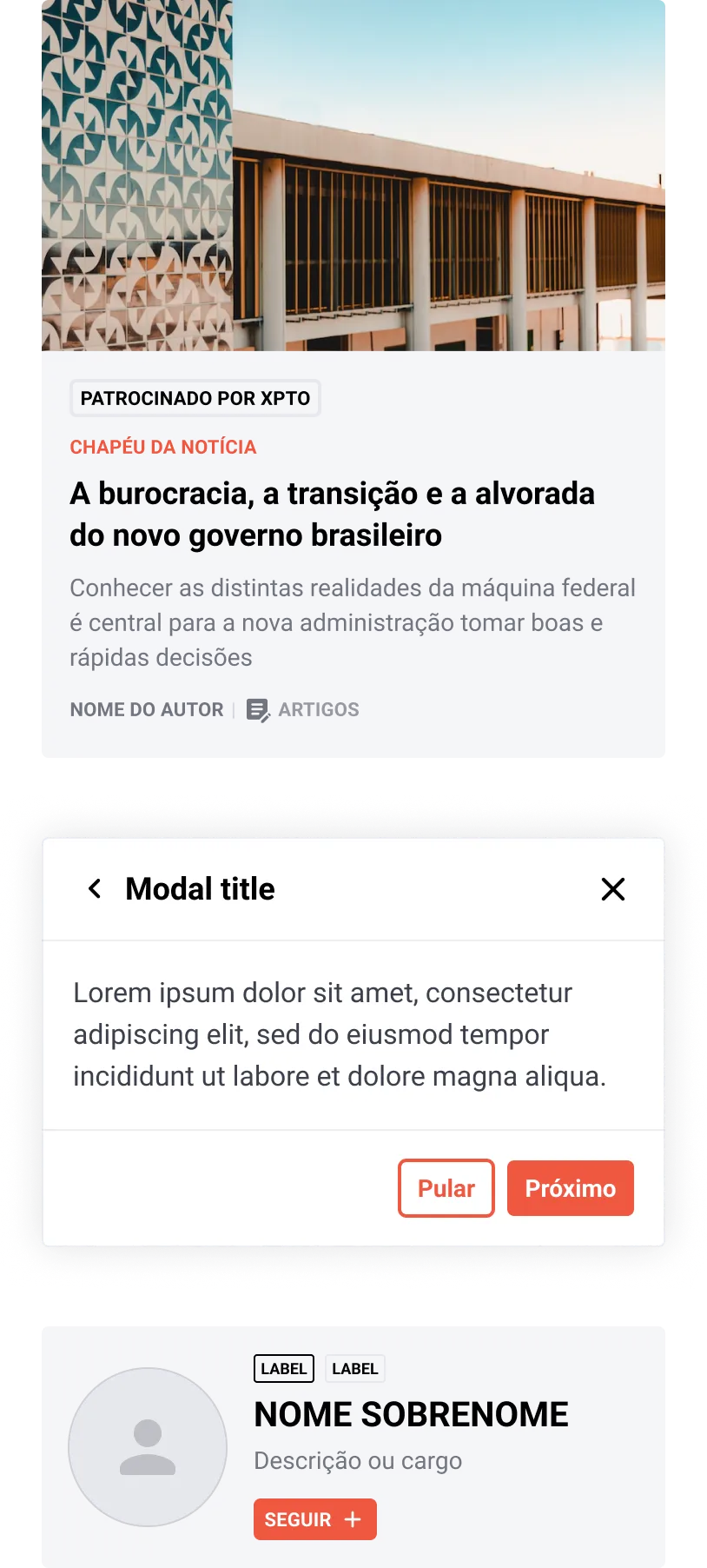
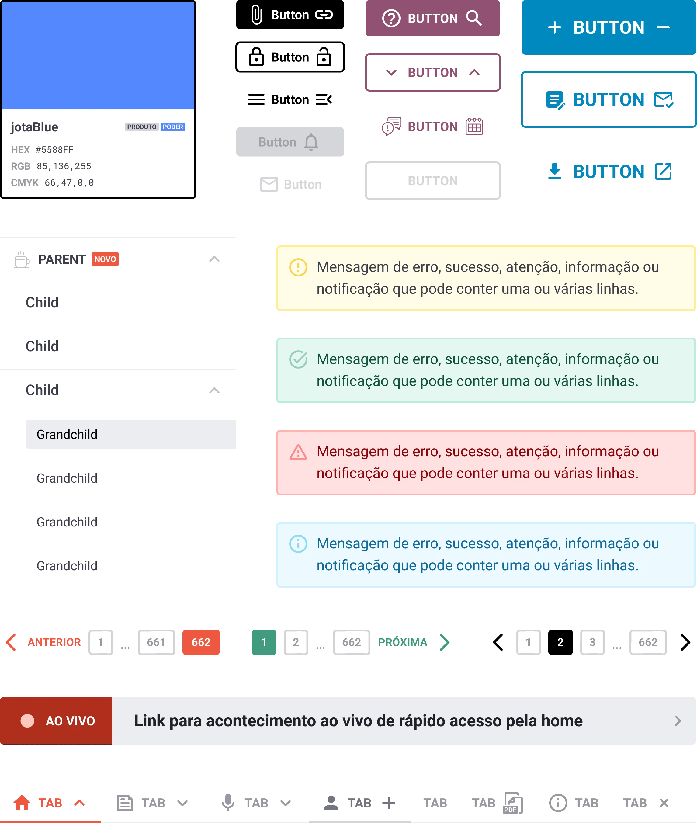
Here are some of the components, starting with the basics: the Button. And then growing exponentially. Below are some examples and variations of the components I've created. To see all of them, check the Figma file.
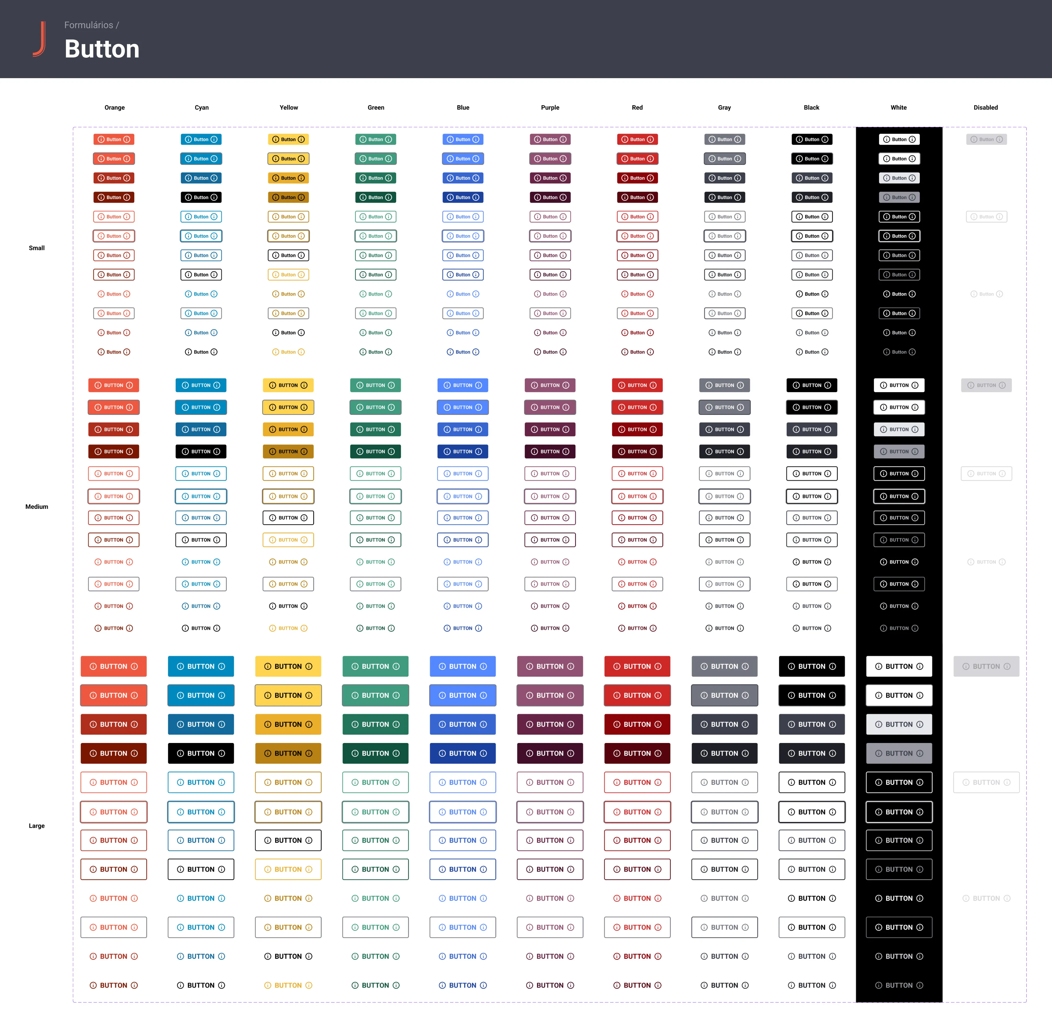
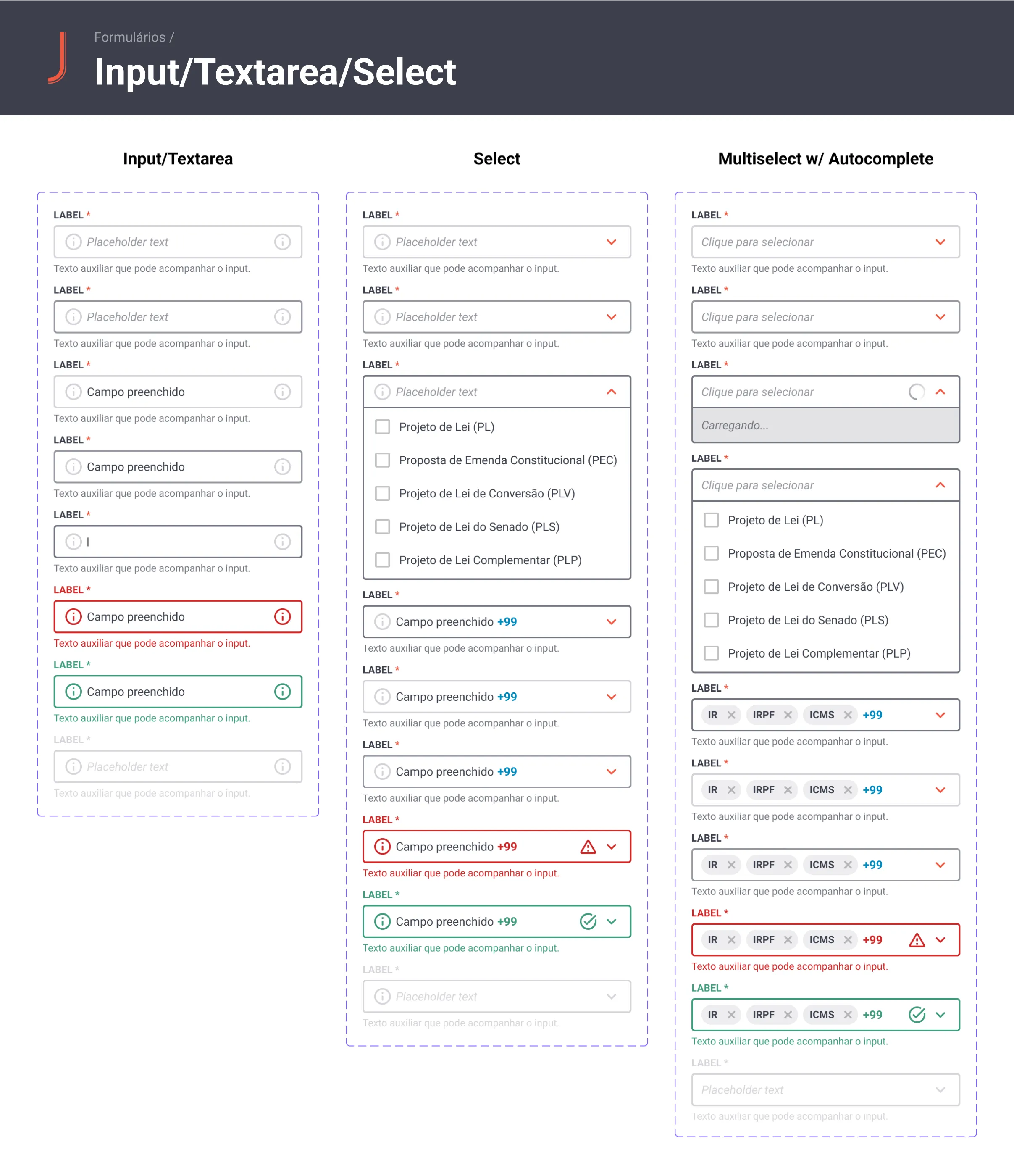
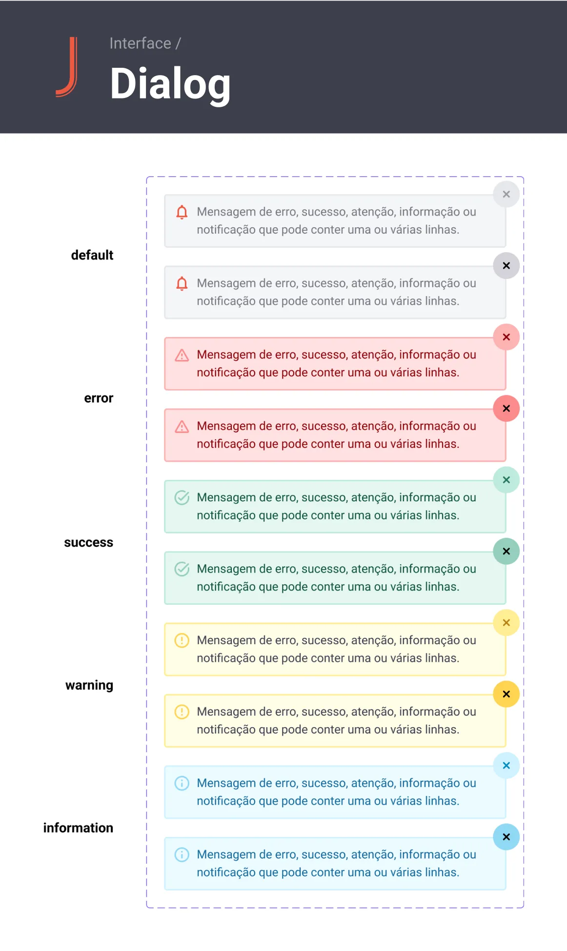
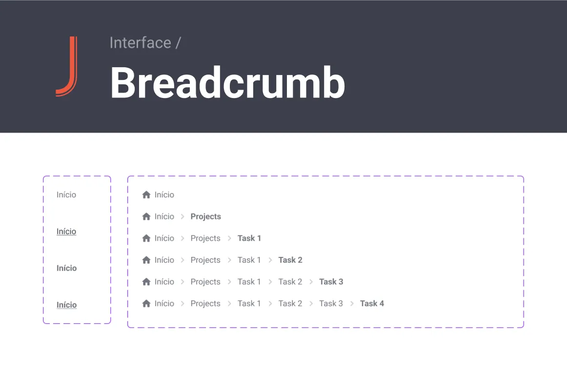
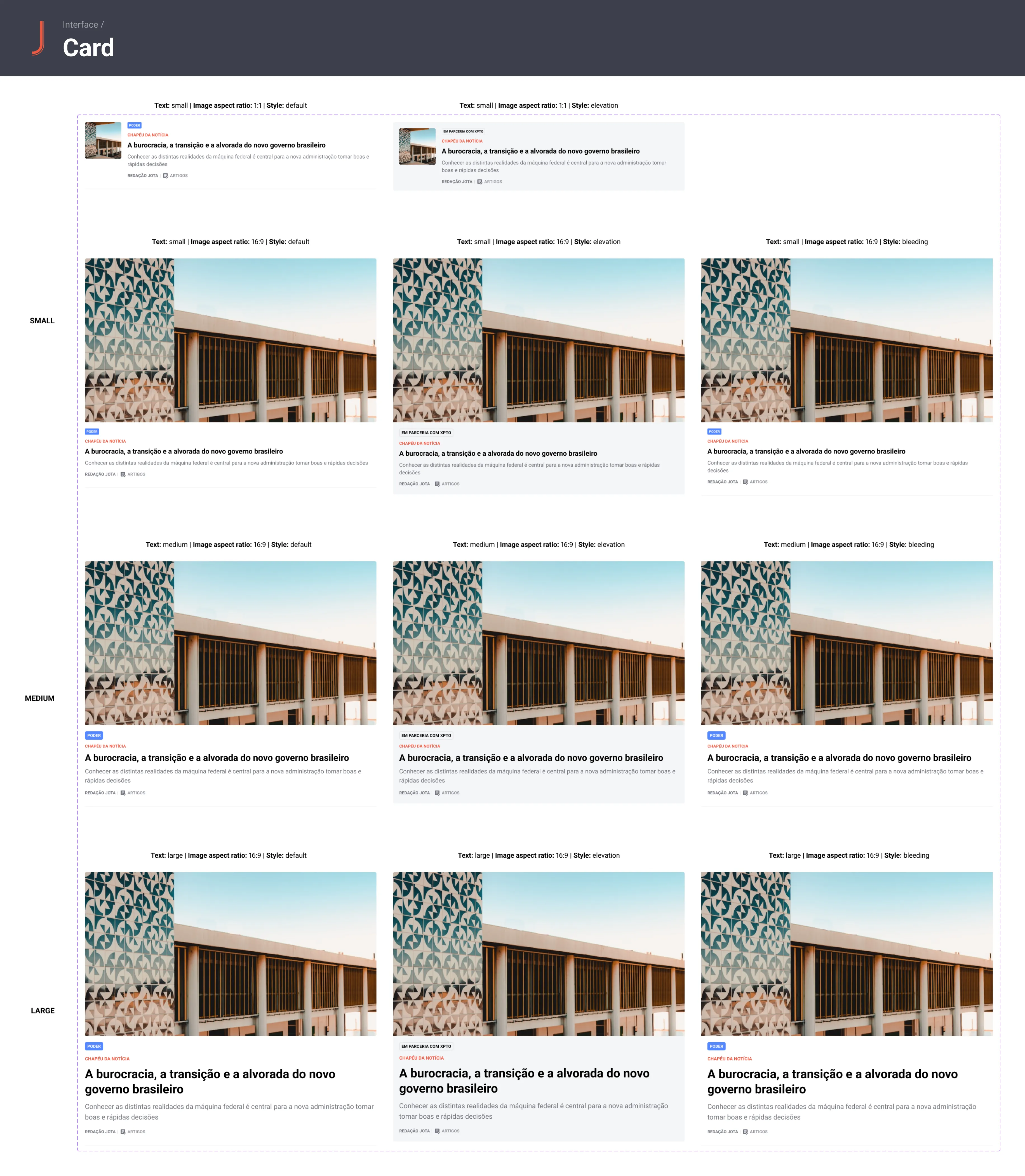
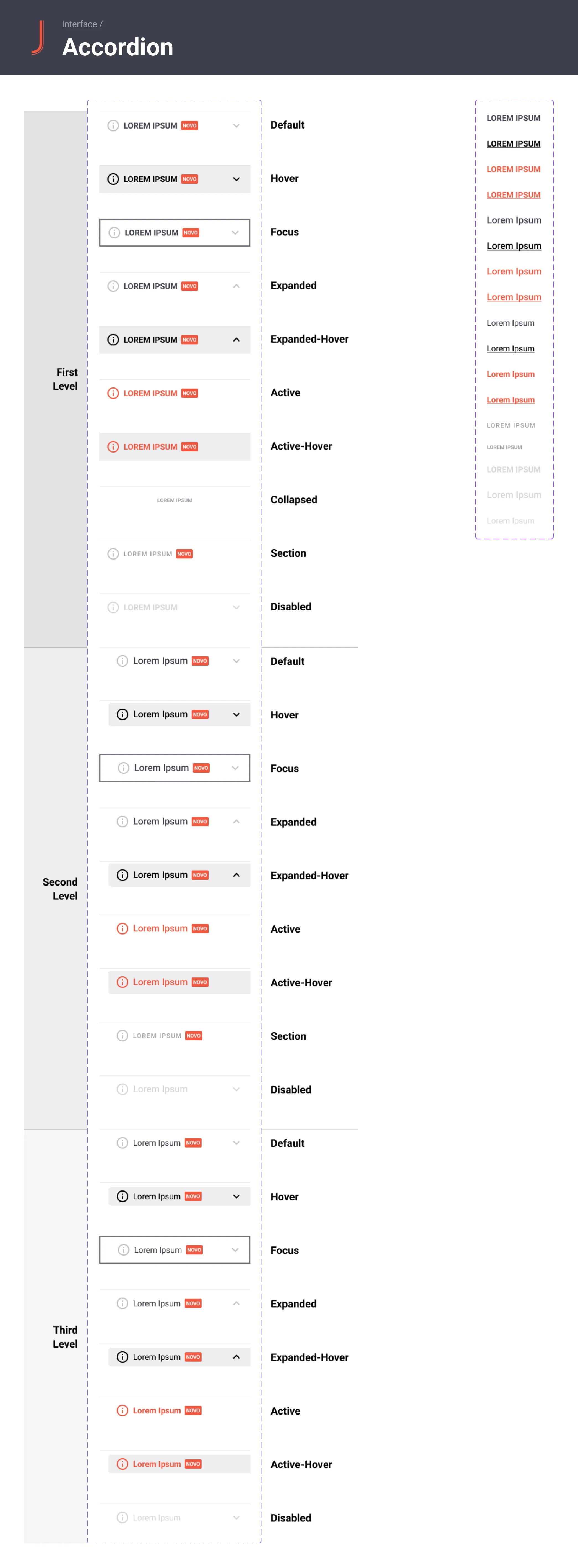
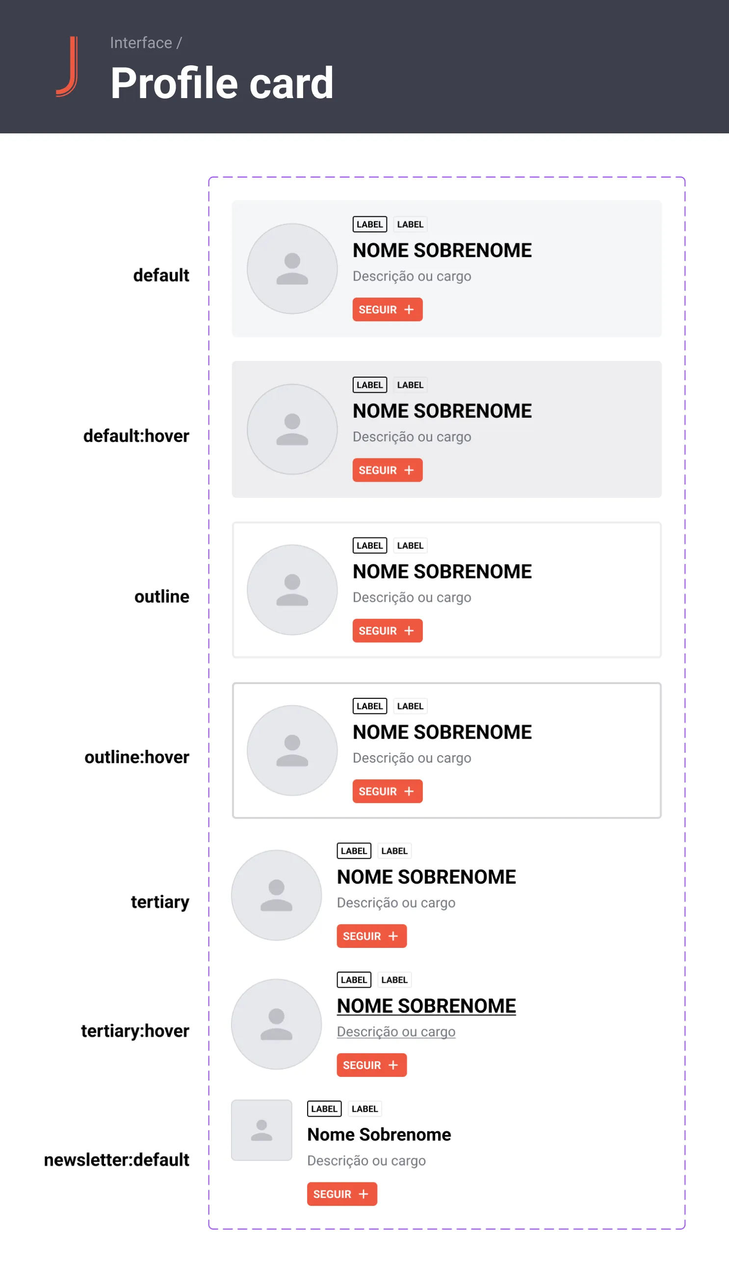
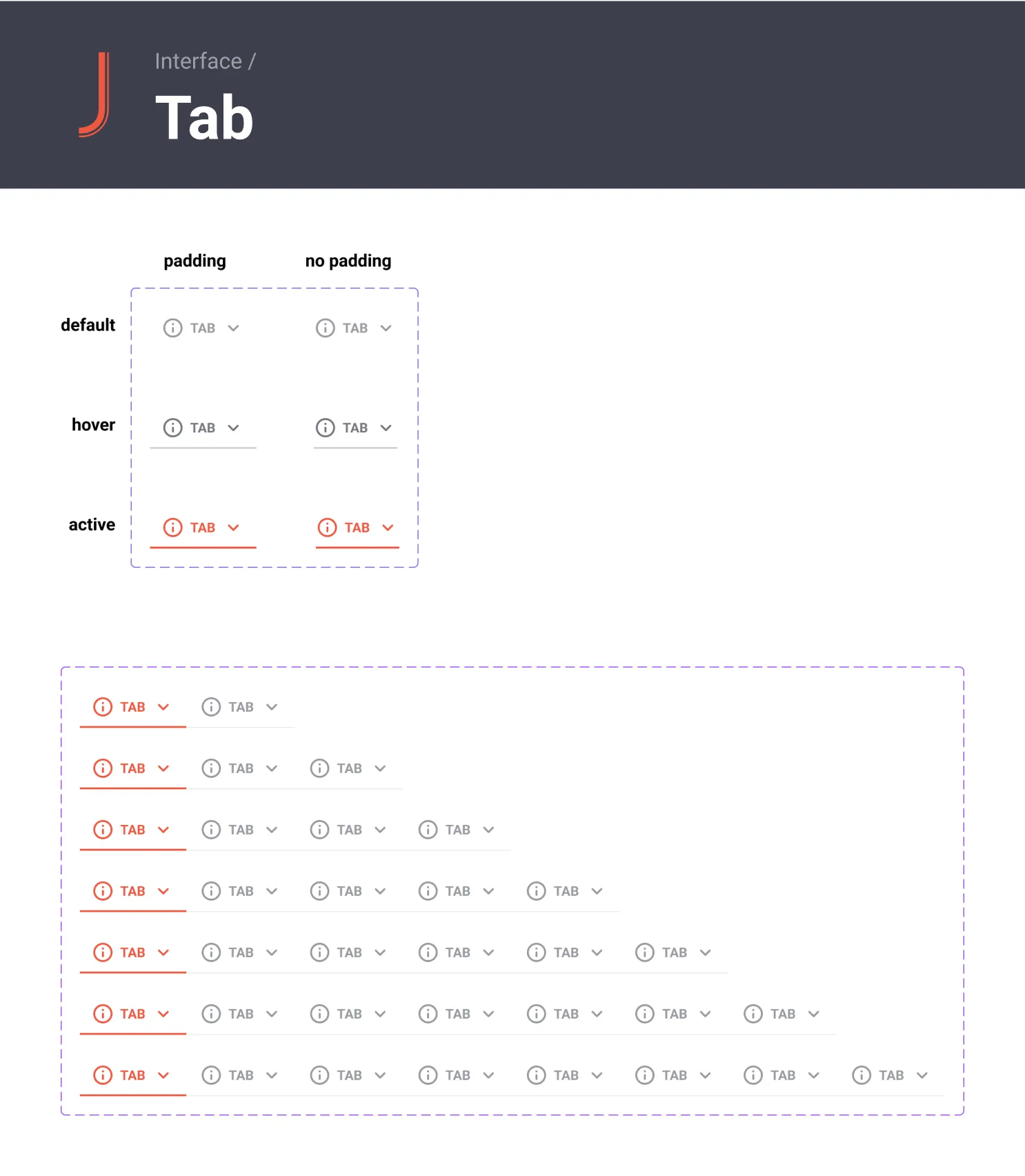
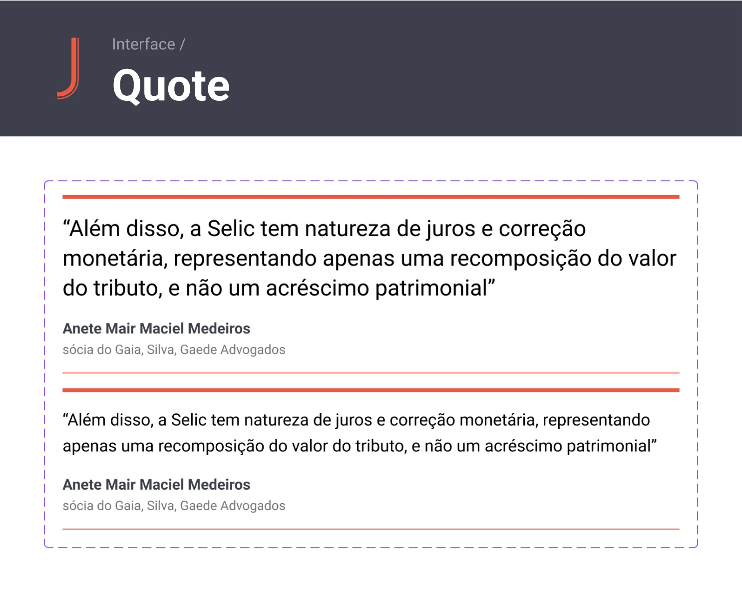
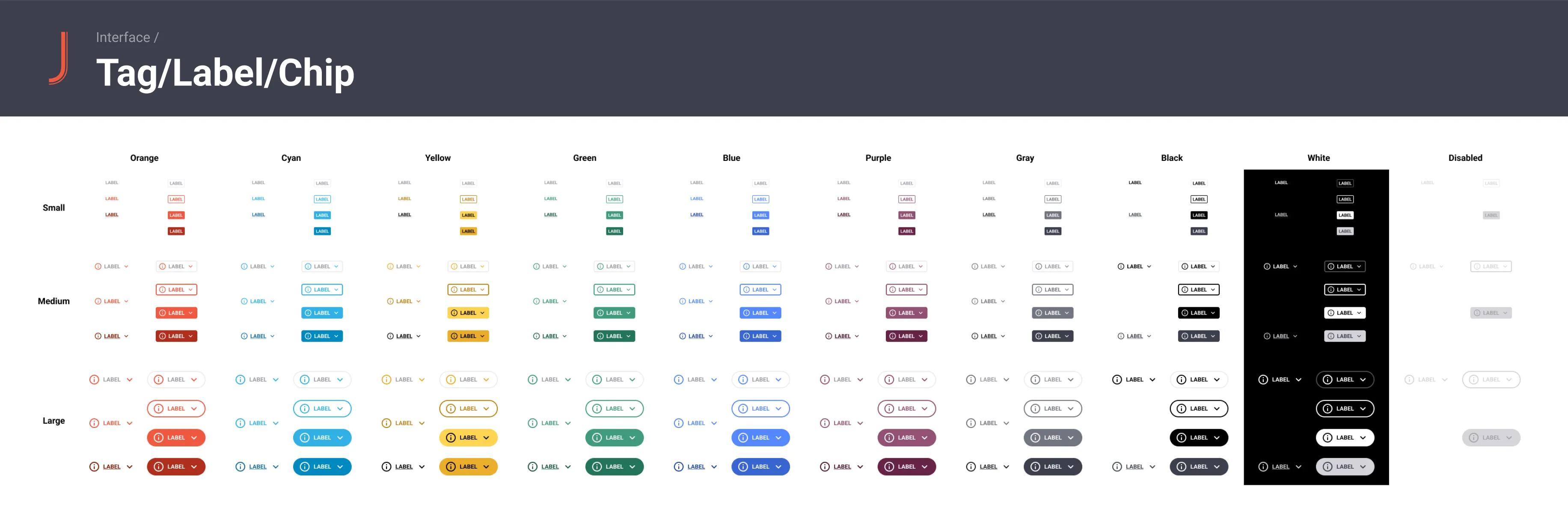
To check the Design System in all its glory, I've made available on Figma. Click on the title on the bottom that says "Design System JOTA - Public" to view all the pages. Or click here.
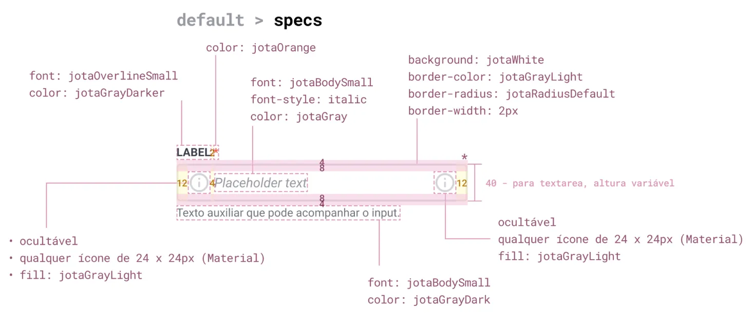
To ensure everything would work as intended, I went to an extensive process of specification of each and every detail of the components, and how would they behave in ”the real world”. At the time Figma Dev Mode wasn't a thing, so this process was a little burdensome, but still absolutely worth it. I've put below a few examples of how I documented the hand-off for the Dev team.
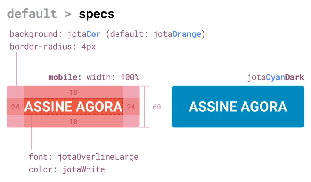
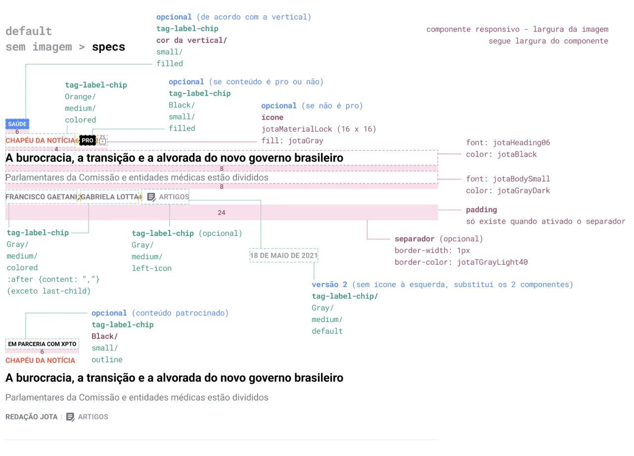
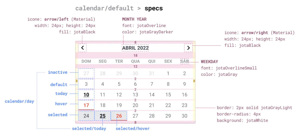

As the Design System evolved, me and my team took the next steps to refine and expand its components to meet the needs of our stakeholders and future products. We began to focus on documentation to ensure that the team has a clear understanding of how to use and effectively contribute to the Design System. Simultaneously, we prioritized the development of new features and enhancements outlined in our roadmap to support the creation of products aligned with the company's goals.
Here's what the implementation of the Design System at JOTA provided us with:
Today we have so much more visual consistency between all deliverables at JOTA across all mediums, not just digital products.
We were able to drastically reduce design and development time by providing reusable components and standardized guidelines.
We built new and scalable products that were aligned with users' needs and JOTA's brand. You can check some of them here and here.
There where more people involved throughout the years, I'd like to thank everyone that helped put this project to life.
This Design System is my pride and joy. It cemented the future for JOTA's digital endeavours, and established my design legacy on the company for many years to come.
Thank you!